How to Use Power BI on Azure to Build a Data-Driven Culture
In 2006, British mathematician Clive Humbly shouted from the rooftops, "Data is the new oil."
Large enterprises are now relying on data to understand customer needs. With departments having dedicated teams and data teams that help crunch the data—how does a team visualise the data to help make decisions, from improving customer needs or bringing new services to the market?
In this blog, we’ll cover the importance of data visualisation and how you can use Power BI to better understand your services and customers.
The Importance of Data Visualisation
Every day your organisation generates more variety of data such as sales revenue, marketing performance, customer interactions, inventory levels, costs and other KPIs. With so much data to filter through, it can be difficult for team members to see the full story that data tells.
Data visualisation helps you easily turn all the granular data into compelling and valuable business information. Think of it like allowing organisations to identify patterns and outliers in large data sets.
There are various methods of arranging information together in a format where the data can be visualised, depending on the data set being modelled and its intended purpose. Different tables and graphs may be utilised to create an easy way to interpret the dashboard. Here are some different types of visualisations to meet your needs.
Histogram
Histograms measure frequencies. The histogram graph shows numerical data distributions using automated data visualisation to display a range of values that can be interpreted.
Fever Charts
The fever chart shows changing data over a period of time. Fever chart can be used as a marketing tool where we could take the performance from a previous year and compare it to a prior year to get an accurate projection for next year. This can help the decision-makers within the organisation to interpret wide and varying data sources.
Heatmap
Method using numerical data points with a graph to highlight in light or warm colours to reveal if the data is a high-value or a low-value point. The Heatmap visualisation method helps the viewer to identify the information.
Infographics
Infographics take a more extensive collection of information, giving a comprehensive visual representation. An infographic is excellent for exploring complex and highly-subjective topics.
Area Chart
Area charts are excellent for visualising data in a time-series relationship. For example, looking at earnings on a month-to-month basis or the popularity of a product, area charts can help visualise the data.
What Is Power BI?
Now we’ve covered the importance of data visualisation, let’s take a look at where and what is Power BI?
Power BI is an interactive reporting platform working with your data and getting the right answers. Power BI can easily handle a wide variety of data types and massive data amounts.
In the actual journey of PowerBI, you are either:
- Creating Reports working with data
- Using reports to make decisions
Creating Reports working with data
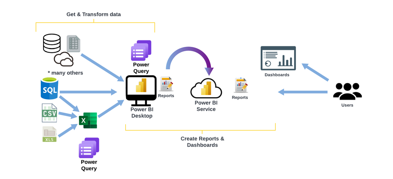
To start authoring the data, you need to download the desktop version of Power BI. Power BI can connect you to a bunch of data sources from Excel, relationship databases, salesforce or even scrape data from a website.
After you connect your data, you want to clean or transform your data. This is about massaging your data and getting it in the correct format if it is not already done at the data source. You can perform a lot of actions to get the data into the right shape as you pull it through to Power BI to ensure you can get the most out of the data.
Once you get the data into Power BI, you need to create additional modelling steps to tidy things up and ensure everything is correct. Once you have got all that data shaped and modelled correctly, you can then build some awesome visuals. It's a case of dragging and dropping, learning the clicks, picking the correct visualisation for your data, and laying out and keeping in mind things like accessibility and the story you want to tell with your data. There's a wide range of visuals to pick from, as well as AI visuals that can take your visualisations to the next level..
Once you have the visualisation ready, you can publish it to the Power BI service allowing people to consume the report.
This is where licences come into play, whether that is Power BI Pro, Premium Per User, or Premium capacity. There are lots of different options and you can find more information on Power BI licensing on the link here.
Using reports to make decisions
If you are currently just consuming reports and want to get the most out of Power BI, be aware of concepts like Workspace versus Apps. These are different ways in which you can consume your reports and dashboards, as well as other ways that you can share.
Inside the Workspace or Apps, you can access the dashboards and interact with the reports, explore your data more, create bookmarks, customise the report for yourself, or personalise it yourself.
The Benefits of Power BI
One of the great benefits of Power BI is the speed of the cloud. Power BI is well known for regular updates. Power BI Desktop is updated once a month, and the actual services within it are updated on a weekly basis.
Power BI Use Cases
You have been reading thus far and are excited to see how Power BI shapes and creates dashboards with your data. You have all this data, but what major use case can you use Power BI to display? Below are some use cases that can be an excellent start for you and your organisation:
Finance: Finance team keep up-to-date with your organisation's cash management, sales, costs, and profits.
- Management: Help the management team get an overview of important KPIs across the organisation, from financial to investor overviews.
- Sales: Help keep track of sales KPIs from opportunities, conversion and metrics.
- Service: Customer service performance and customer retention.
Power BI on Azure
Why Connect Azure to Power BI?
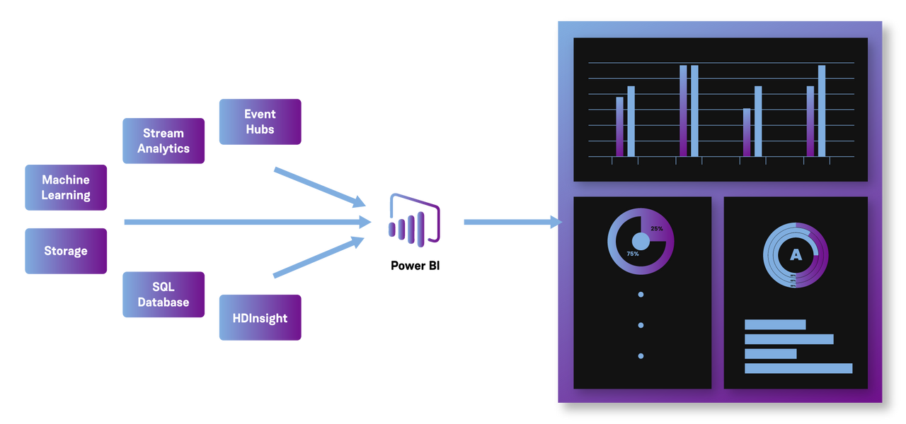
Power BI has multiple Azure associations available, and the business intelligence solutions you can create with those services are unique to your business. You can connect a handful of Azure data sources or a small amount. You can then shape and refine the data to build a customised report.
What Services Can You Connect to Power BI?
Power BI has multiple Azure associations available, and the business intelligence solutions you can create with those services are unique to your business.
You can start with an Azure SQL Database to create reports that monitor your essential data and use the reports to identify trends or KPIs.
Power BI Embedded
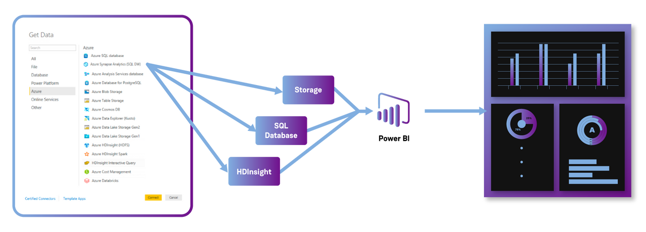
With Power BI Desktop and Azure services, you can use the Get Data dialogue box if you have complex data and all different data sources. You can connect your Azure SQL Database, Azure HDInsight data source and Azure Blob Storage (or Azure Table Storage). Simply select the service you need and refine it from there.
You can also create reports using the same data connections for different types of users using the same Query and create a new report that refines the visualisations required.
Case Study: Royal London Group
To gain a deeper insight into the software delivery lifecycle and to achieve greater transparency regarding the state of the different services, Royal London Group (RLG) reached out to Contino to support the existing engineering team with building a data analytics solution to ingest and translate data from several identified data sources, and turn that data into meaningful insight for a variety of internal customers; better known as the Apollo project.
Taking its name from the Greek god of truth, Apollo is RLG’s transparent and data-led approach to identifying opportunities for improvement across its software services.
By identifying where the organisation invests its time and effort from an engineering perspective, RLG is able to transform and grow key services; whether that’s addressing dependencies that are negatively impacting the speed of change, introducing more automation to speed up deployments or resolving consistent failures in a service to improve resiliency.
Key Metrics
During the first phase of the Apollo project, Contino and RLG focused on four key metrics (these are common indicators of high-performing teams):
- Lead time in delivering value for the customer: how long does it take to go from idea to production?
- Deployment frequency to production: how fast are we deploying changes?
- Mean time to recovery (MTTR): when we have an incident in production that is causing a particular outage or disruption to our service, how fast can we respond and restore service?
- The change failure rate for deployment: when we’re deploying through the environments, how often is it succeeding vs failing?
You can read more about the case study here.
In Summary
As your data grows it becomes increasingly difficult to present—data analytics tools are becoming a more and more critical asset to every organisation. Data analytics tools such as Power BI can provide real-time information, allowing you to solve problems and identify opportunities quickly.
Why not try and give your reports more of a story? If you want to know more about Power BI, contact our team.


